Data Professional Survey Dashboard
Data Professional Survey Breakdown Dashboard
Overview
This dashboard provides an in-depth analysis of a survey conducted among data professionals. It includes insights into demographic information, job satisfaction, salary distribution, and the popularity of programming languages within the field.
Visualizations and Insights
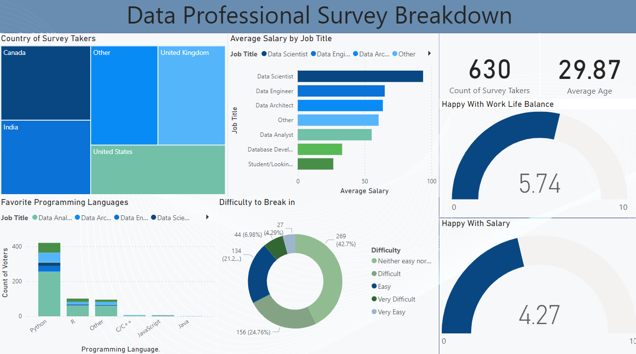
- Country of Survey Takers:
Description: This treemap visualizes the distribution of survey respondents by country.
Insight: The majority of respondents are from the United States, followed by significant representation from India, the United Kingdom, and Canada. - Average Salary by Job Title:
Description: A bar chart showing the average salary for different job titles in the data profession.
Insight: Data Scientists earn the highest average salary, followed by Data Engineers and Data Architects. Database Developers and students/looking for jobs earn the least on average. - Survey Count and Demographics:
Description: Key metrics showing the total number of survey takers and their average age.
Insight: There are 630 survey respondents with an average age of 29.87 years. - Job Satisfaction Metrics:
- Happy with Work-Life Balance:
Description: A gauge chart measuring satisfaction with work-life balance on a scale from 0 to 10.
Insight: The average satisfaction score is 5.74, indicating moderate satisfaction among respondents. - Happy with Salary:
Description: A gauge chart measuring satisfaction with salary on a scale from 0 to 10.
Insight: The average satisfaction score is 4.27, indicating relatively lower satisfaction with salary. - Favorite Programming Languages:
Description: A bar chart showing the most popular programming languages among different job titles.
Insight: Python is the most favored programming language by a wide margin, followed by R, C/C++, and JavaScript. Other languages like Java are much less popular. - Difficulty to Break In:
Description: A pie chart illustrating the perceived difficulty of breaking into the data profession.
Insight: A significant portion of respondents (42.7%) found it "neither easy nor difficult" to enter the field. However, a notable percentage (21.2%) found it difficult, and only a small fraction found it very easy.
Data Source
The data for this dashboard comes from a survey conducted among data professionals. The survey includes questions about demographics, job satisfaction, salaries, and preferences in programming languages.
Tools and Technologies
Data Analysis and Visualization: The dashboard was created using data visualization tools such as Tableau or Power BI.
Design: The visualizations are crafted to provide clear and actionable insights into the data profession, highlighting key metrics and trends in the industry.
Conclusion
This dashboard provides a comprehensive overview of the data profession based on survey responses. It sheds light on demographic distributions, job satisfaction levels, salary averages, and programming language preferences. These insights are valuable for both current and aspiring data professionals to understand the landscape of the industry.
Portfolio Application
This dashboard is part of my professional portfolio, showcasing my skills in data analysis, visualization, and interpretation. It demonstrates my ability to extract meaningful insights from survey data and present them in an engaging and informative manner.